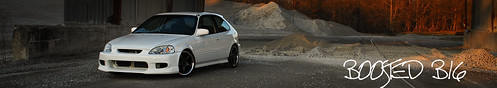
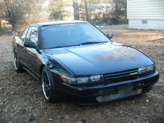
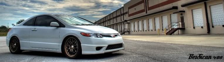
i was bored....
1. original
2. re-edit
3. re-edit #2


1
2
3


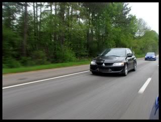
i was bored....
1. original
2. re-edit
3. re-edit #2

original looks better to me.
:idb:
you dont think the tree line to sky looks super fake?Originally Posted by G.C


i do. i like number 2 the best... the other two look TOO edited. just my

1 ... to bright in #3
GECKO SQUAD MEMBER
MSS RACING REPRESENTA.....
the saga continues....
yeah 3 was just for shits and giggles, an attempt too make the car "pop" but i dont know how i feel about it

numero uno

Original looks really good but the 2nd looks a lot more realistic. I don't know what you're doing with the third one hah

I like the first, that blue in the sky makes the picture just pop


number one

#2 for me. like you said #1 looks fake in some area's and #3 looks like my old pictures lol...........

#2 because the road is darker but the sky and trees need a lil more saturation..

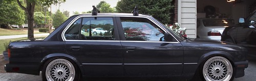
looks like half the batmoblie crusin.
yeah i know.....this is one of those shots that i really didnt like too much but i thought it had potential so i came back to it and started playing with it.

number two is the best imo.
Yeah it does a little, but the sky looks really cool to me. And the car looks better in the first pic to me compared to the second one.
Second one looks dull to me.
:idb:

I like the 1st pics car and shadowing on the car and the 2nd pics back ground... ?? I guess lol

Dont rush me bish, Im workin on it. LOL. But I absolutely suck at it
Im gonna go with #1
its a HARD edit isnt it?!?! this shot is a mofo.

2nd

2 for me

one is the best overall composition

Num-er Won!
Peek-a-boo mofucka what now?!

Gonna have to go with 2.

original
Mainstream Performance
i say #2. IMO in #1 the trees take a little to much focus from the car
thats why i desaturated them in the re-edit

honestly i think number 2.... in the first the car looks a little fake especially from the front tire back...

I agree that #2 is the best. Btw, is this Ryan's new whip?
nah this is roberts car...he is friends with ryan and forged did all his work.

I like Number 1 bro..
your pics are always Great man!

#1 imo. I like the bright green trees.
4.
///M-Sport Coupe + VTEC

prob has RE30's gay

2 definitely 2, loooks more...... realistic
CANT STOP WHAT YOU CANT CATCH
:idb::boobies:I EAT PUSSY FOR REPS! LOL :boobies::idb:

original seems pretty saturated. i didnt know you swap out your skys that often. second re-edit is hella contrasted.
i'm a whore
HF
id say about 50% of the skies in my photos are dropped in. the sky in the 2nd shot is even dropped in lol but i left the all trees...i couldnt make them GTFO without it looks fake
i agree. skank.

hmm i dunno man..the contrast just seems abit weird..even on the original..the backround just seem real bright and light. just my opinion tho
riding low is like a religion
 Posting Permissions


 Reply With Quote